WORKING AT A YOUTH ORCHESTRA
In March of 2020, no one had any idea of what was to come, but I had just started a new job at Empire State Youth Orchestra, a program servicing hundreds of local youth, and would find myself working in the office for a total of 3 whole weeks before the world-wide shutdown. In my time at ESYO, I was fortunate enough to work on a variety of projects both print & digital. When I joined the hardworking team of full-time staff, ESYO had just recently commissioned a rebrand with a lovely logo and colors, which I was able to use to help create a cohesive and more extensive visual brand identity for the organization, and would eventually end up teaching my coworkers how to properly implement. During my time at ESYO, I worked closely on visual, and brand-related projects with Marketing Manager, Justin Cook, and Video & Web Producer Griffin Bengraff. Below you can find a sampling of some of my work for ESYO.
BRANDBOOK
The ESYO brand I came into, was a great rebrand from their older, dated branding, but wasn’t refined enough to create a consistent appearance over all ESYO materials. With input from the Executive Director, and Marketing Manager, as well as some from the rest of the ESYO team, I was able to compile full branding guidelines for the organization. I made minor adjustments to the color palette and expanded it to include value variations of each color to allow more contrast; I paired down and specified when and which fonts to use from their very large typeface family; I added information about how ESYO photography should look and be used, and refined ESYO’s brand language for staff to reference, so they can keep a consistent brand “voice”.
BEFORE (ESTABLISHED WHEN I STARTED)

AFTER (ONE PAGER GUIDELINE)
AFTER (FULL BRAND GUIDELINES I CREATED)
AFTER (FULL BRAND GUIDELINES I CREATED)
ESYO STATIONERY, FORMS & DOCUMENTS
Over my time with ESYO, I worked on updating all their business stationery; letterhead, envelopes, business cards, folders, notecards, etc. The existing materials were bland and dated, and we wanted new designs to go with the new brand identity. Everything needed to be a unit, and make ESYO quickly identifiable and more than just standard, plain, and corporate. I also cleaned up, redesigned, and created many forms with ease of use in mind at all times. Form design should not get in the way of filling them out. I often tested different approaches to forms on co-workers to find the option that was best interpreted and filled out. I also worked on many documents such as member and board handbooks, taking copy and formatting it in a clean and comprehensible manner.
Front & back of envelopes, front & back of business cards, letterhead, and front of folder
Folder front
Folder opened
Folder back
Sponsorship form front - click to enlarge
Sponsorship form back - click to enlarge
In-kind donation form - click to enlarge
Mailed monetary donation form - click to enlarge
CONCERTS & FESTIVALS
As a youth orchestra, ESYO had plenty of musical performances. For larger performances, I was asked to brand them separately from ESYO’s standard branding. Some more than others. When we were unable to hold concerts in person, we put together digital performances, and released them on YouTube. For videos, I needed to create different assets form standard concerts - like credit lists, lower third banners, and title cards; Whereas for standard performances, I’d create things like programs, signage, and occasionally festival shirts.
SOUNDING TOGETHER
Sounding Together was ESYO’s solution for holding a performance during lockdowns. We wanted something that felt like a celebration of our ability to still make music amidst a pandemic, and represented the method we used of having individual videos combined into a beautiful orchestra. So, inspired by the musical tie in ESYO’s logo, I created a geometric confetti design. This festival was a collaboration of many, many hands towards the final product. My part was to create the overall visual identity, as well as the title and credit motion graphics, and stationary lower third banners that were then handed off to be included in the performance. Play the video below to view day 1 (days 2 and 3 can be found on ESYO’s YouTube channel).
TUTTI!
Tutti, meaning “all together”, was ESYO’s second virtual festival. For the design, we decided to stick closer within ESYO’s standard branding in order to begin to establish the new brand to our members and audience. With a digital sound readout inspired design, I chose to pair the subtle audio sound bars with an upbeat comic style font. Similar to Sounding Together, I provided overall visual guidelines and stationary graphics to our video producer, to incorporate into the video. Play the video below to view the first day of the festival (for day 2, visit ESYO’s YouTube channel).
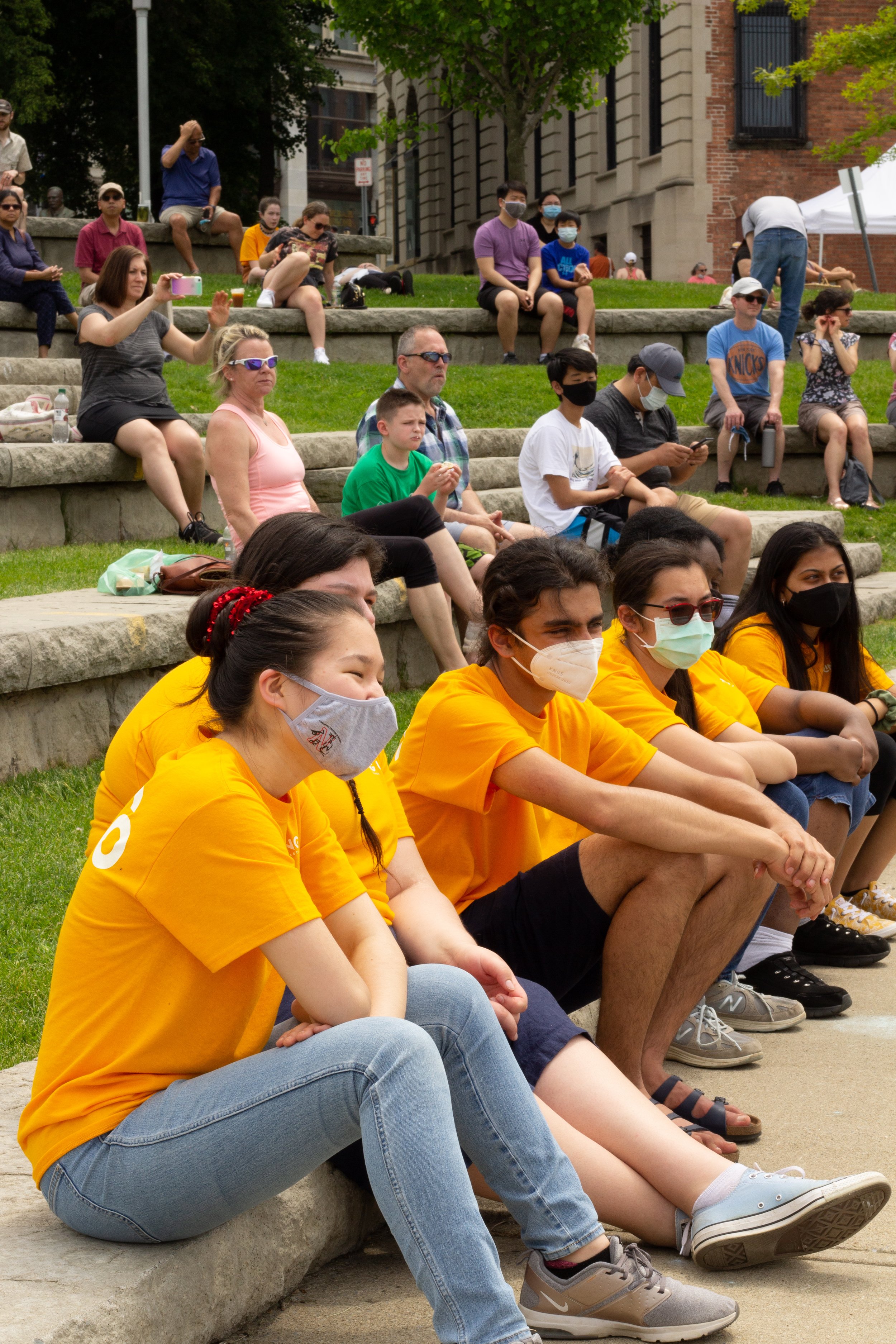
PLAYATHON
Playathon is ESYO’s annual Fundraiser where the entirety of ESYO, gathers in the mall with friends, family, and donors. All ESYO ensembles, including the CHIME program, get a chance to perform for mall-goers throughout the day-long event. There are auctions held to get a chance to conduct an ensemble, and donations get rained down on performers from the balcony above them. Initially, I was tasked with branding the marketing and signage for just the 2022 event, but ESYO’s Executive Director, Rebecca Calos, loved the result so much she decided it would remain for years to come, changing up the primary color each year. The inspiration for the event branding came from video games and 80s/90s arcades. Internally, we had members competing to raise the most most money, emailing them weekly stats in the form of leaderboards, and carried over the bright, almost neon colors with a deep contrasting blue to our external communications and public promotion and signage.
Large sign posted by performance area with schedule and simple instructions on how to donate

ESYO’s Symphony Orchestra Conductor, Etienne Abelin (Center), with 2 members, all wearing the bold pink Playathon shirts. This pink was a favorite among many members and was chosen to make us identifiable in a crowd, and to unify everyone in a sea of hot pink to make passers-by say “Woah, what’s happening here!?”
Primary social media post to inform followers of the event
Social media post about special audtion to encourage preliminary bidding online
Flyer to advertise Playathon (back after COVID cancellations), and special auction
“Level Up” was our internal competition between members to raise the most money for Playathon. I created a custom game character inspired by Space Invaders as a mascot.
Results of raised funds were emailed and posted in Google Classrooms each week. There were individuals and teams, this is an example of a teams results. “Sapphire” and “Onyx” levels were added later, when fundraising went above and beyond our expectations.
ENCORE STAGE
Encore Stage, is a cabaret-style event for Seniors in ESYO. They perform to friends and family in groups or as individuals to showcase their talents and celebrate their final year of high-school together. I was asked to create a permanent brand for Encore Stage, since it was an annual occurrence that had no true existing identity. We determined Encore Stage should evoke a feeling of youthful celebration yet remain formal as well. Thus, I decided on a sunset/sunrise color scheme to symbolize the end of one era and beginning of the next, paired with a fun-but-simple serif font bringing a mature elegance. Among the darkened room, the brightness of the branding was able to stand out, without taking center stage away from the performers.
Welcome sign stationed at theater entrance
Instagram post calling for seniors to sign up for the event
List of performances which were available upon entry and placed on audience tables
Stickers made at the members’ request featuring a ‘fermata’ - a musical notation indicating a note should be held longer than typical - to symbolize the continuation of the musicians’ journeys after ESYO and High School
Front of one of the congratulations cards sent to ESYO seniors
Back of a congratulations card sent to an ESYO senior
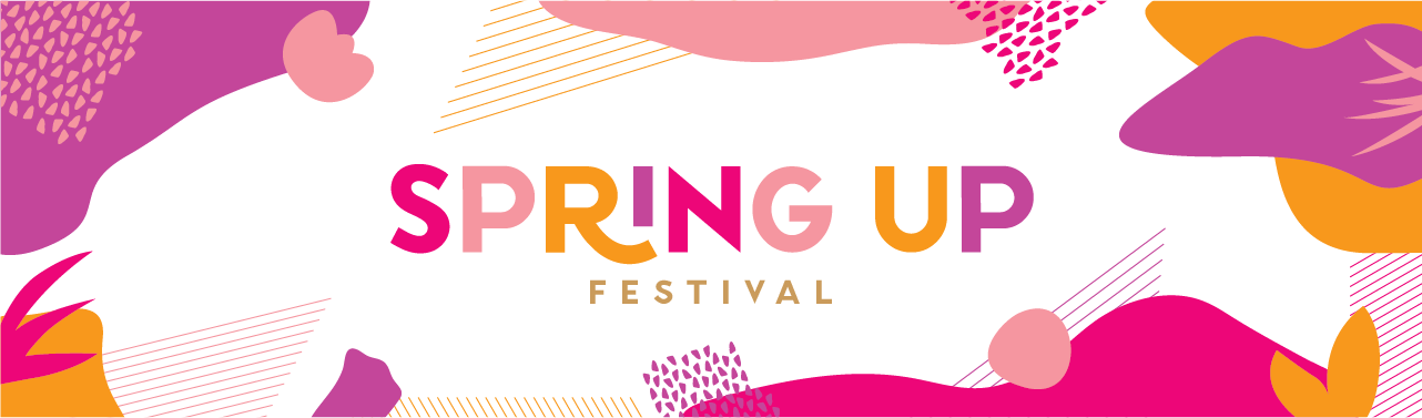
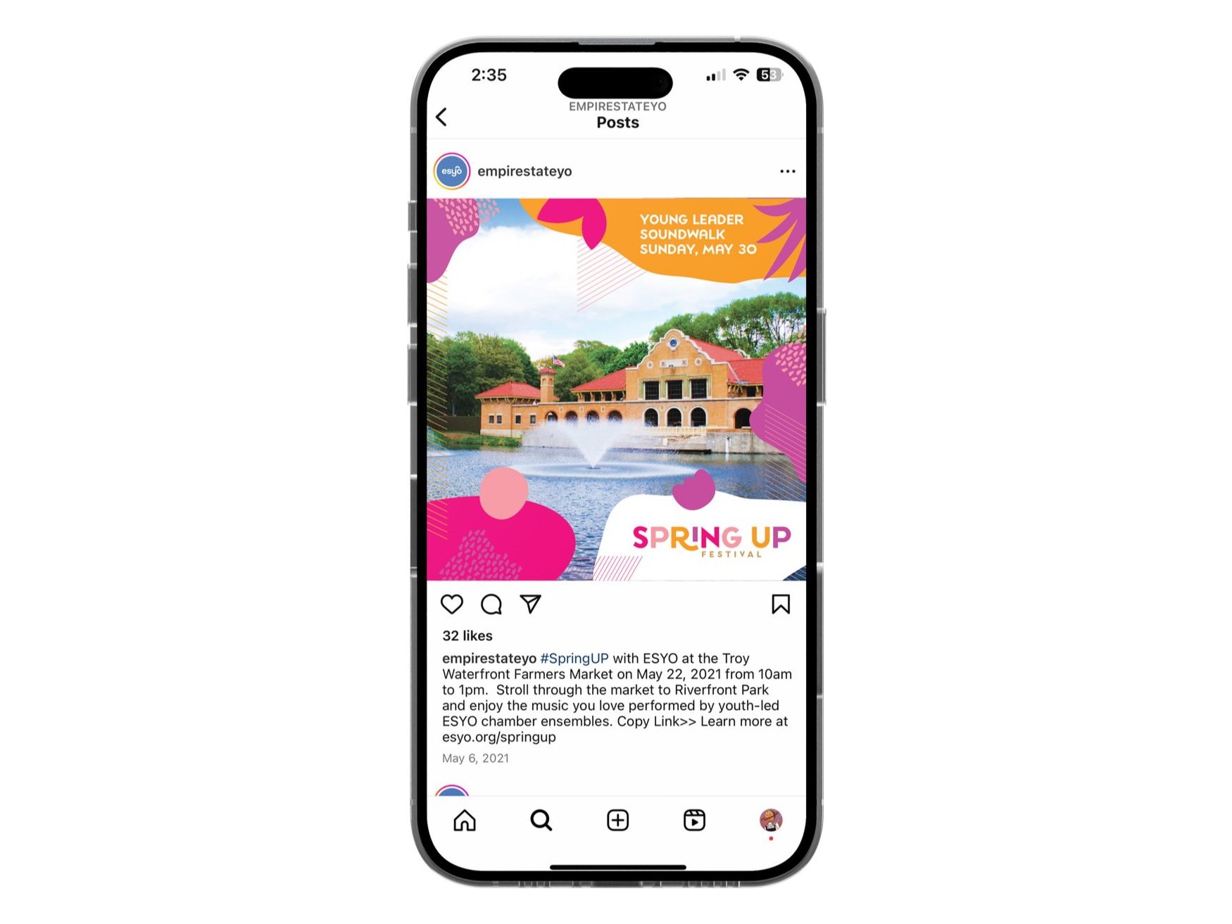
SPRINGUP FESTIVAL
SpringUP was ESYO’s first in-person event back, after COVID. It was held outside at the Troy Farmer’s Market and showcased several student groups and ensembles performing a variety of pieces. We really wanted to focus on an excited visual design that embraced the springtime, so I chose a bright color palette of pinks, purples, and golds, and paired them with abstract and organic shapes. This allowed for an event brand that stood out among the neighboring vendors, and got people excited for ESYO’s events to be back in person!

Side 1 of large postcard mailer sent out to ESYO and surrounding community

Event social post. Not all pre-prepared designs were ultimately posted.

Facebook post

Young Leader benefit post

Event sign placed at donation table

Side 2 of mailed postcard

Festival social post

Virtual Mainstage event post
Young Leader event post
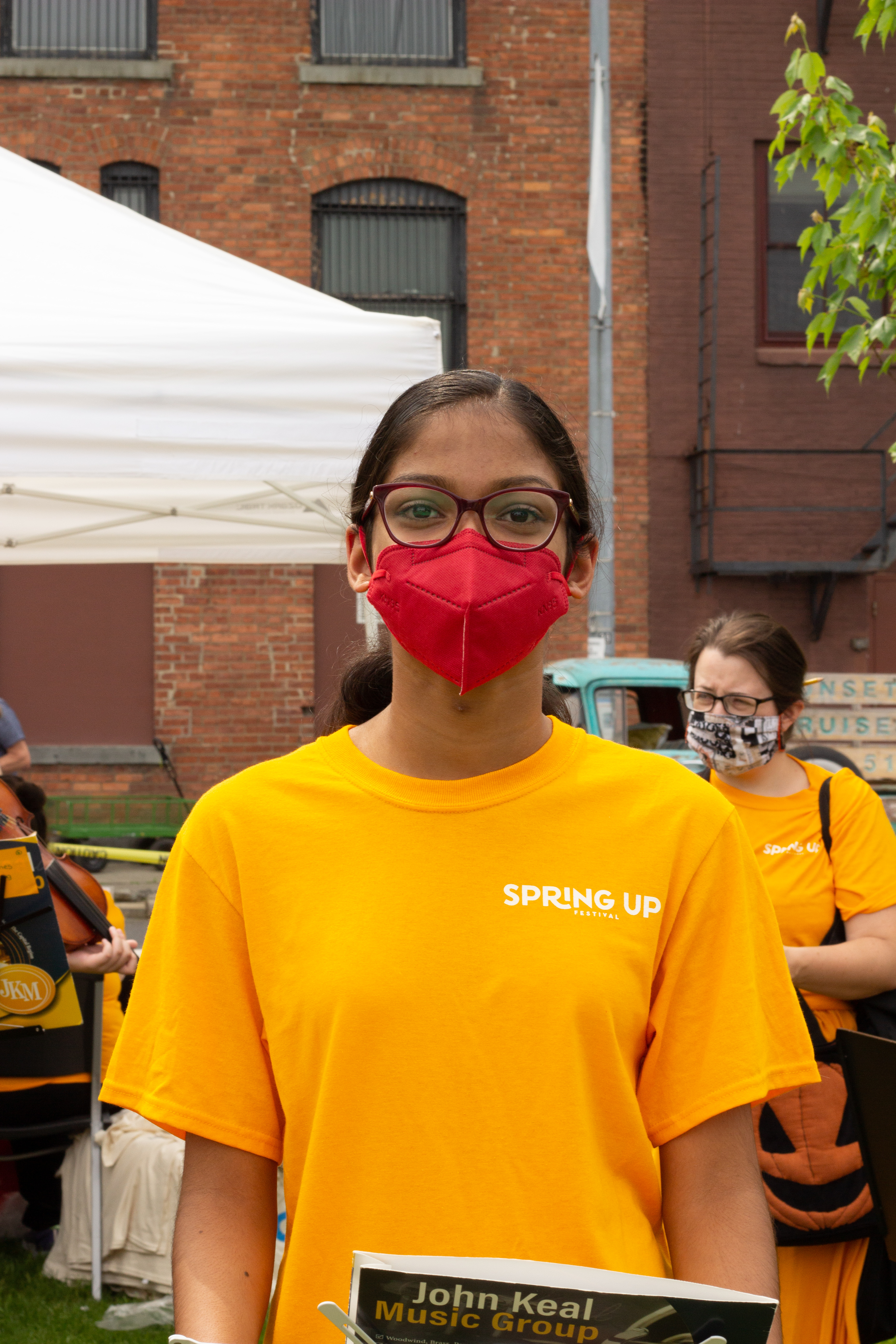
Member wearing event shirt with SpringUP logo on front, and large ESYO logo on back
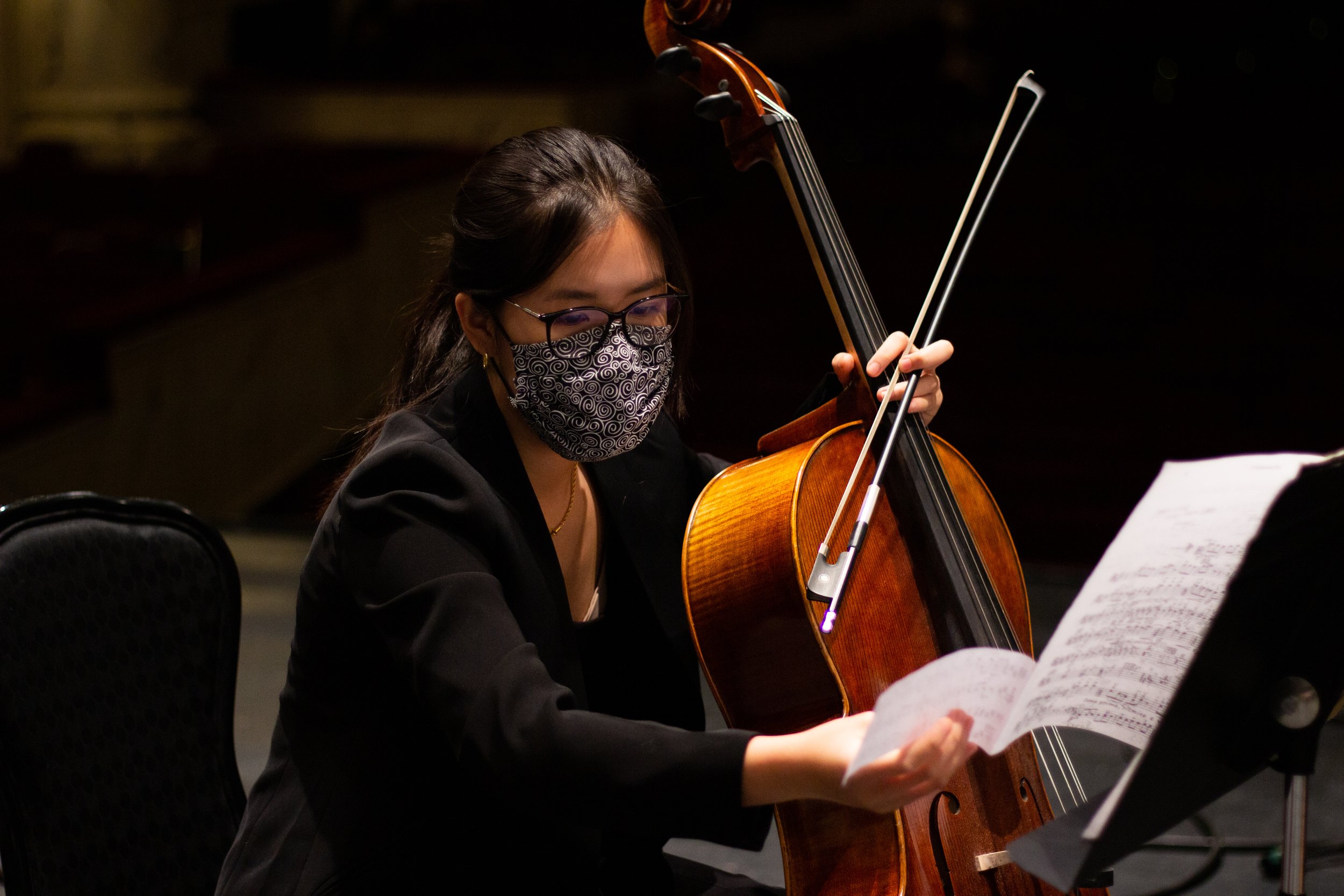
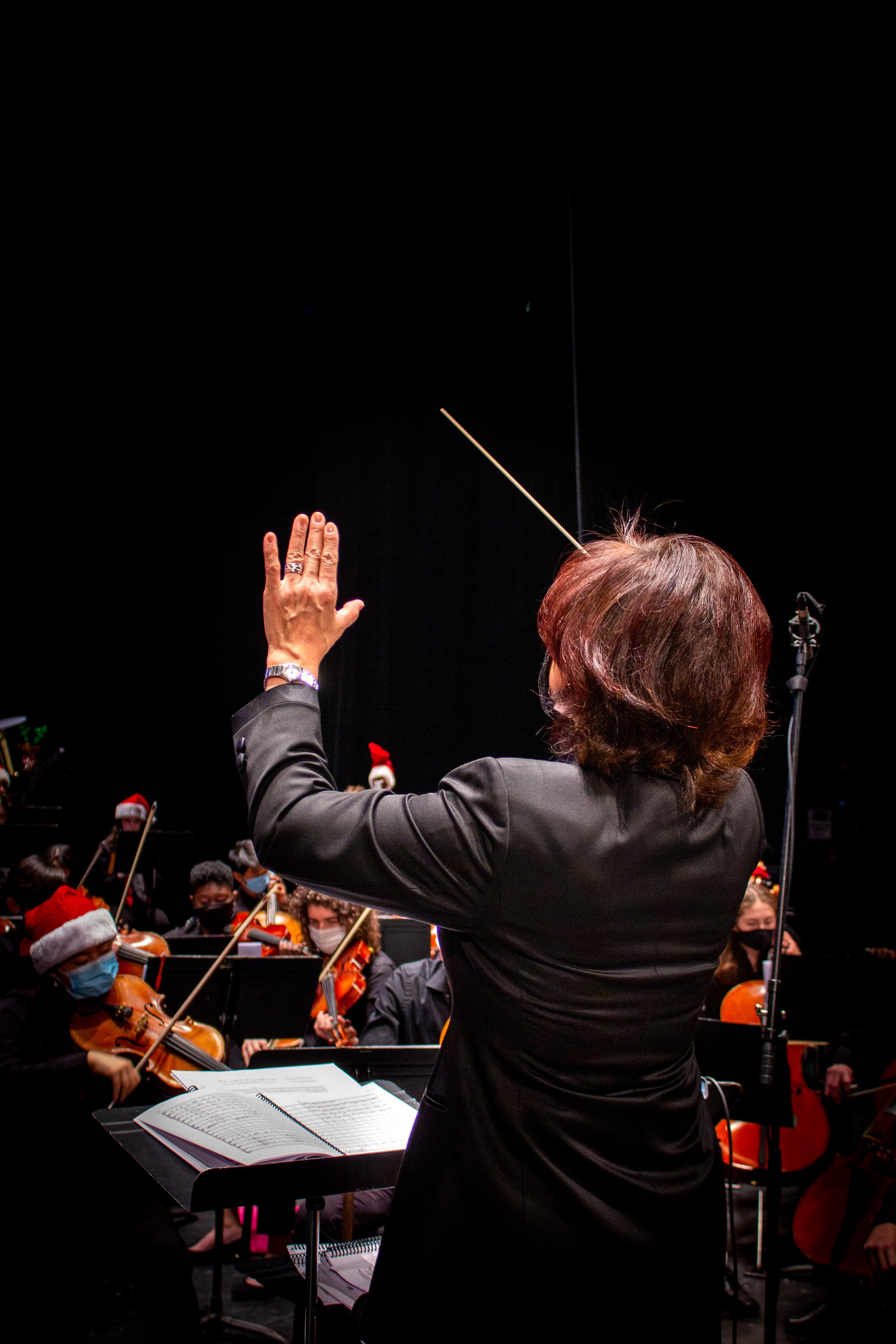
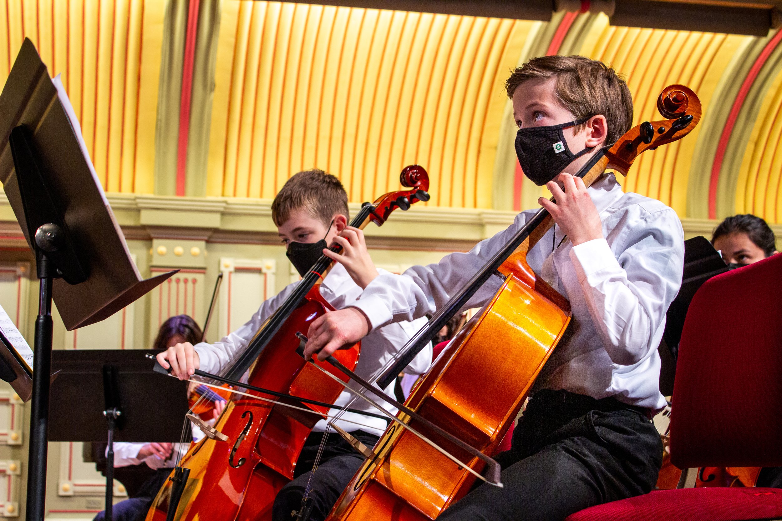
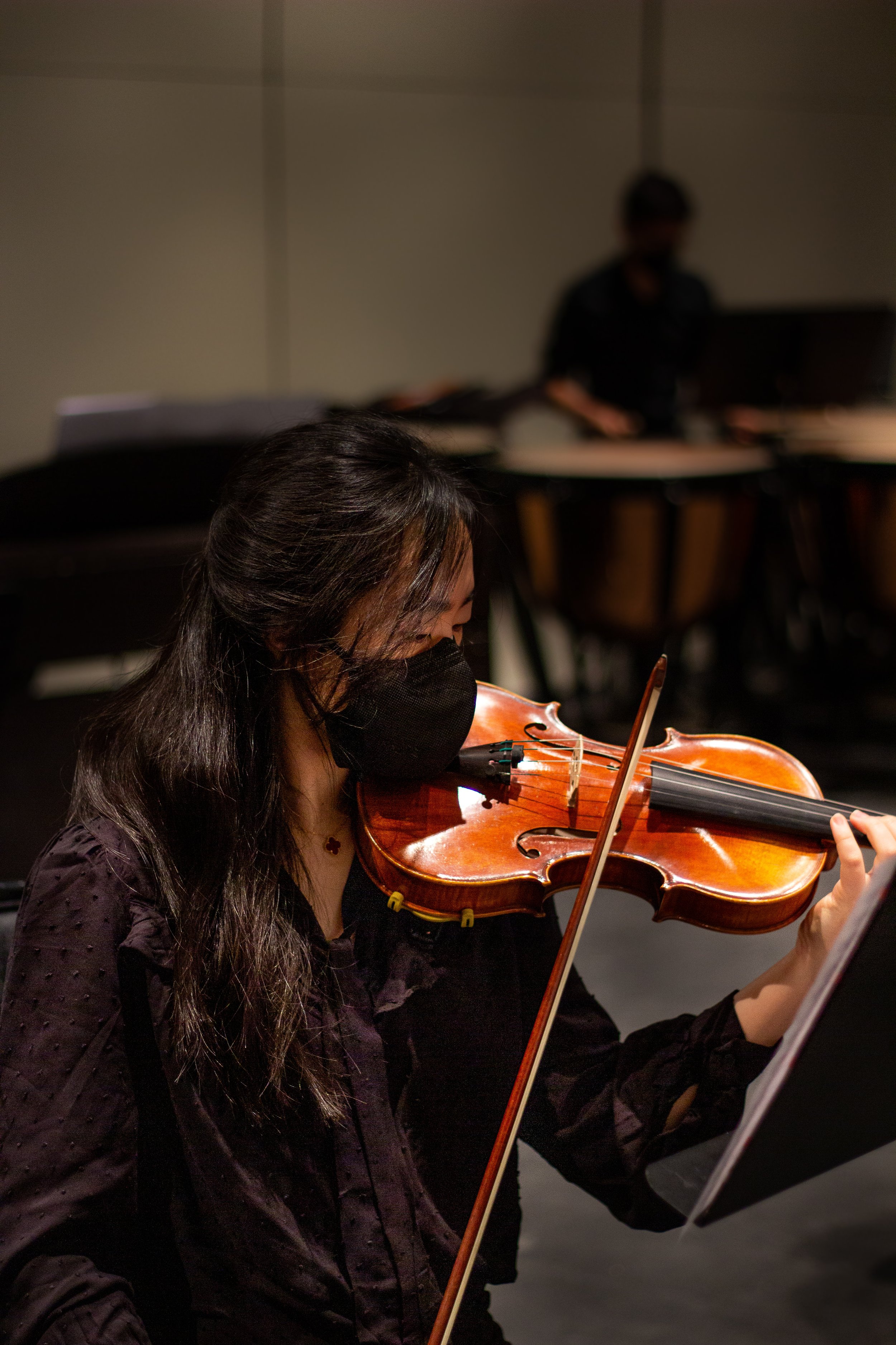
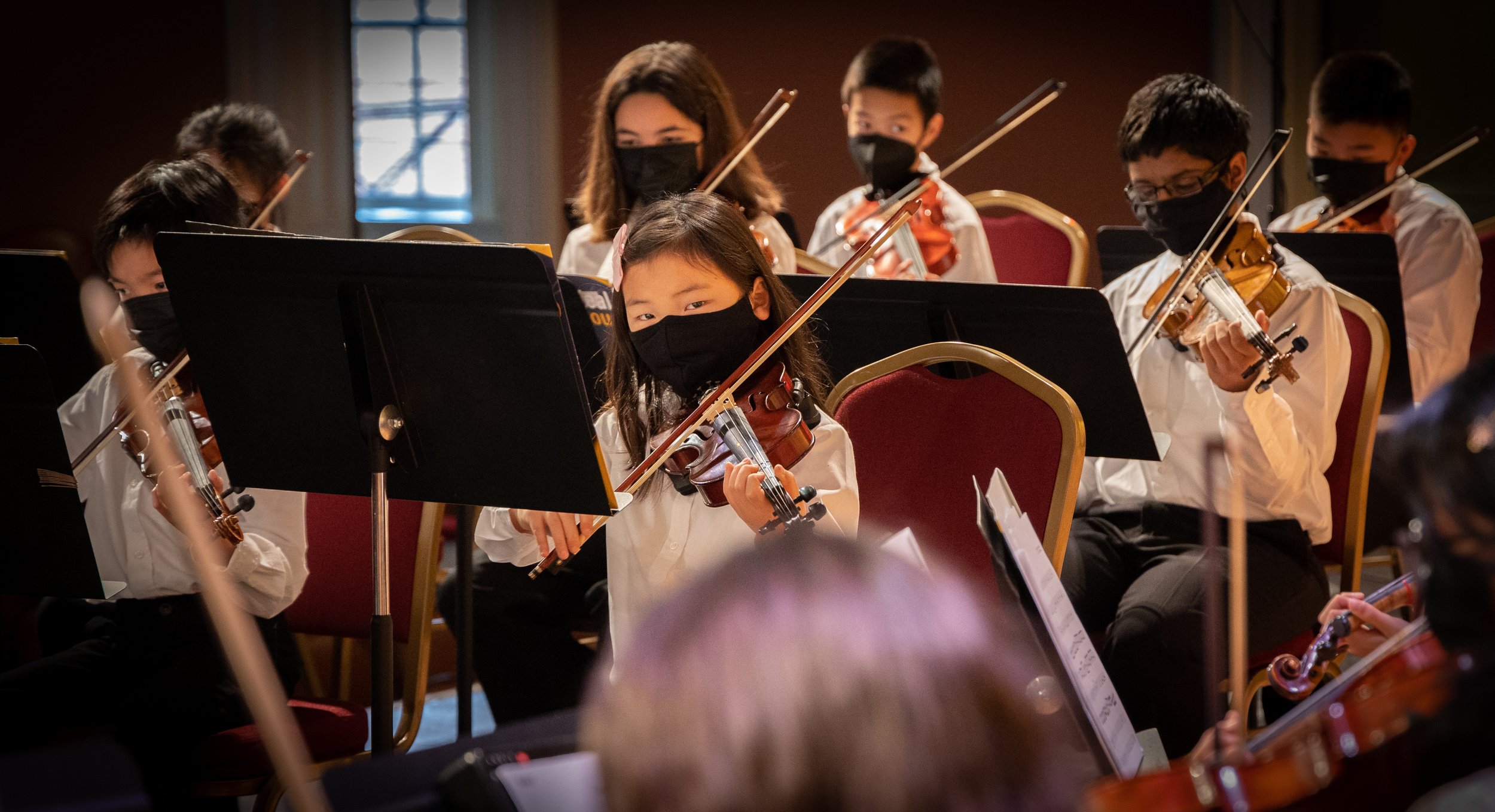
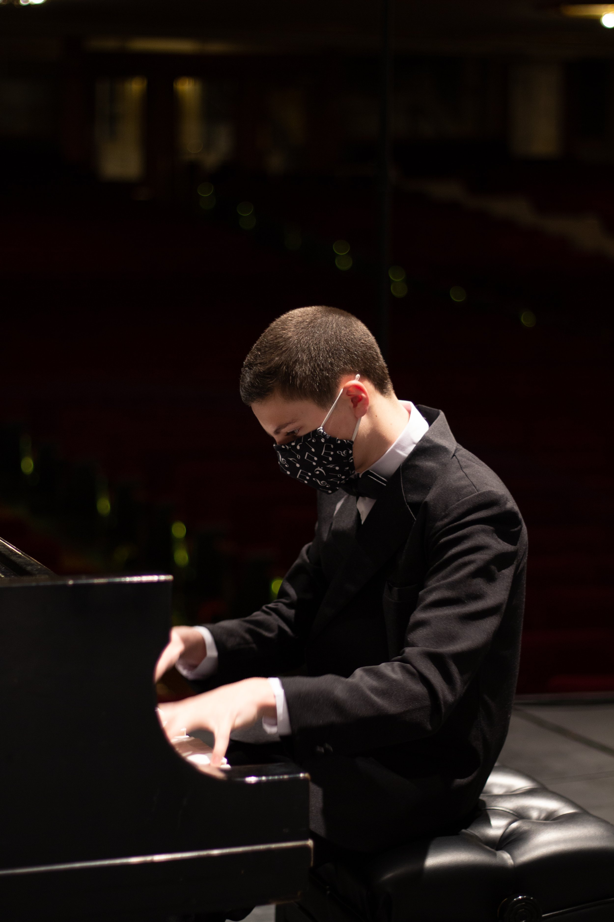
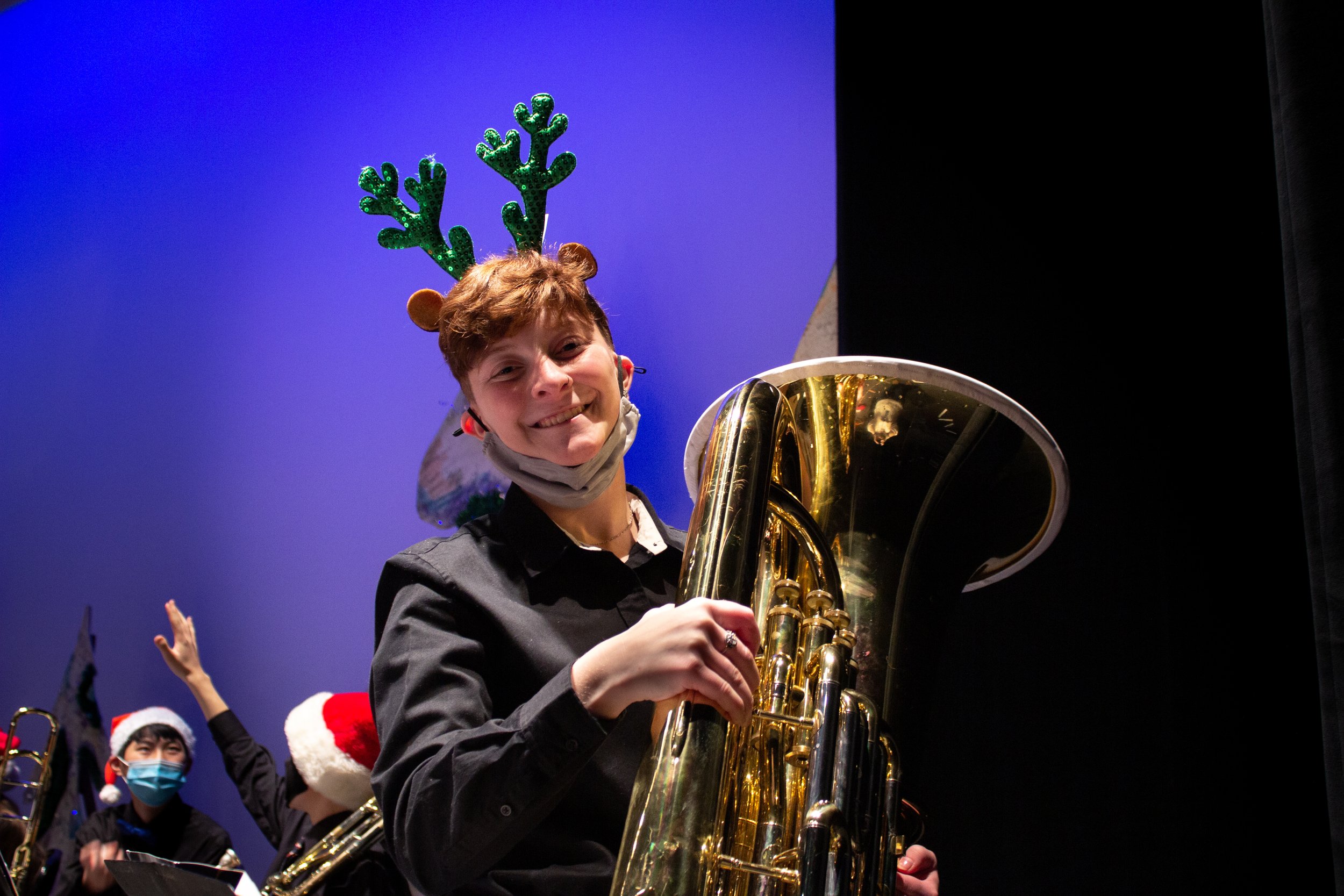
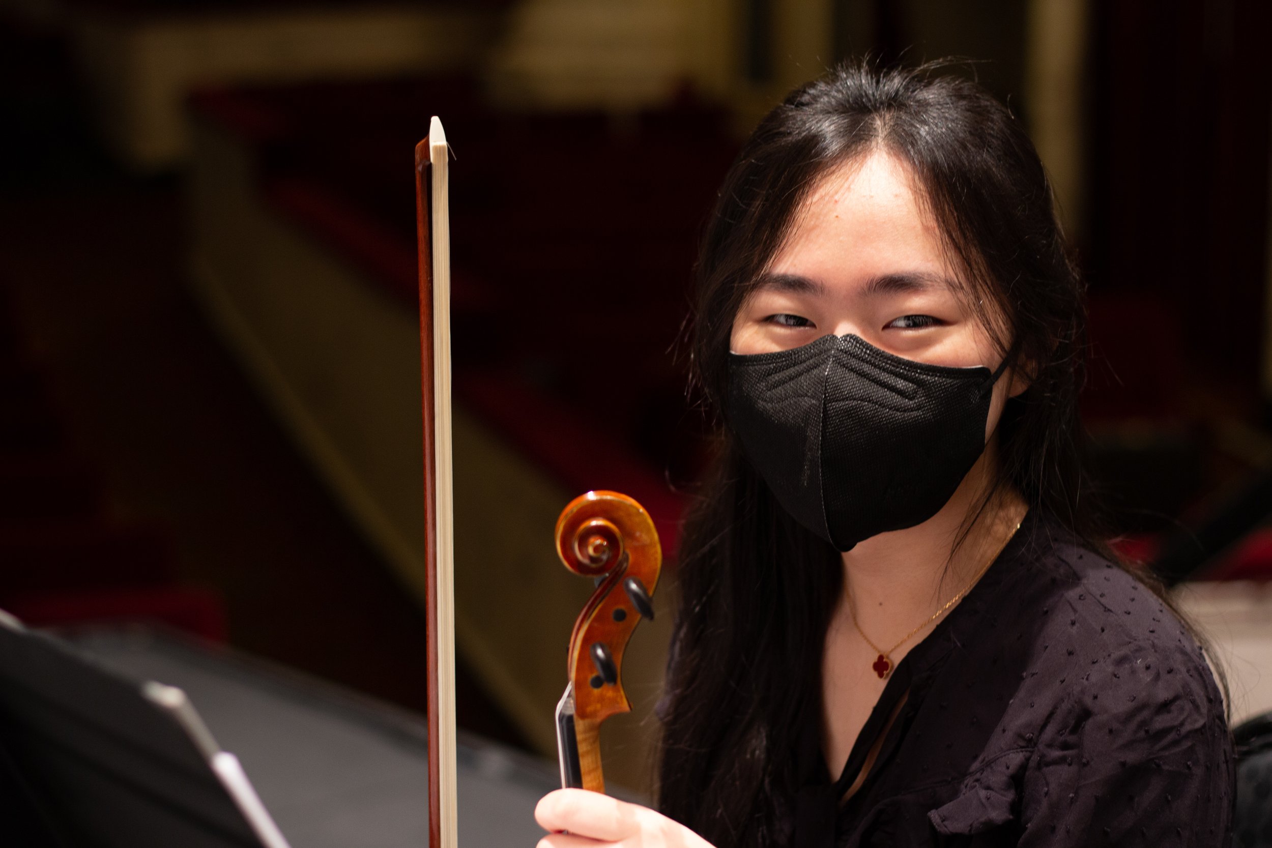
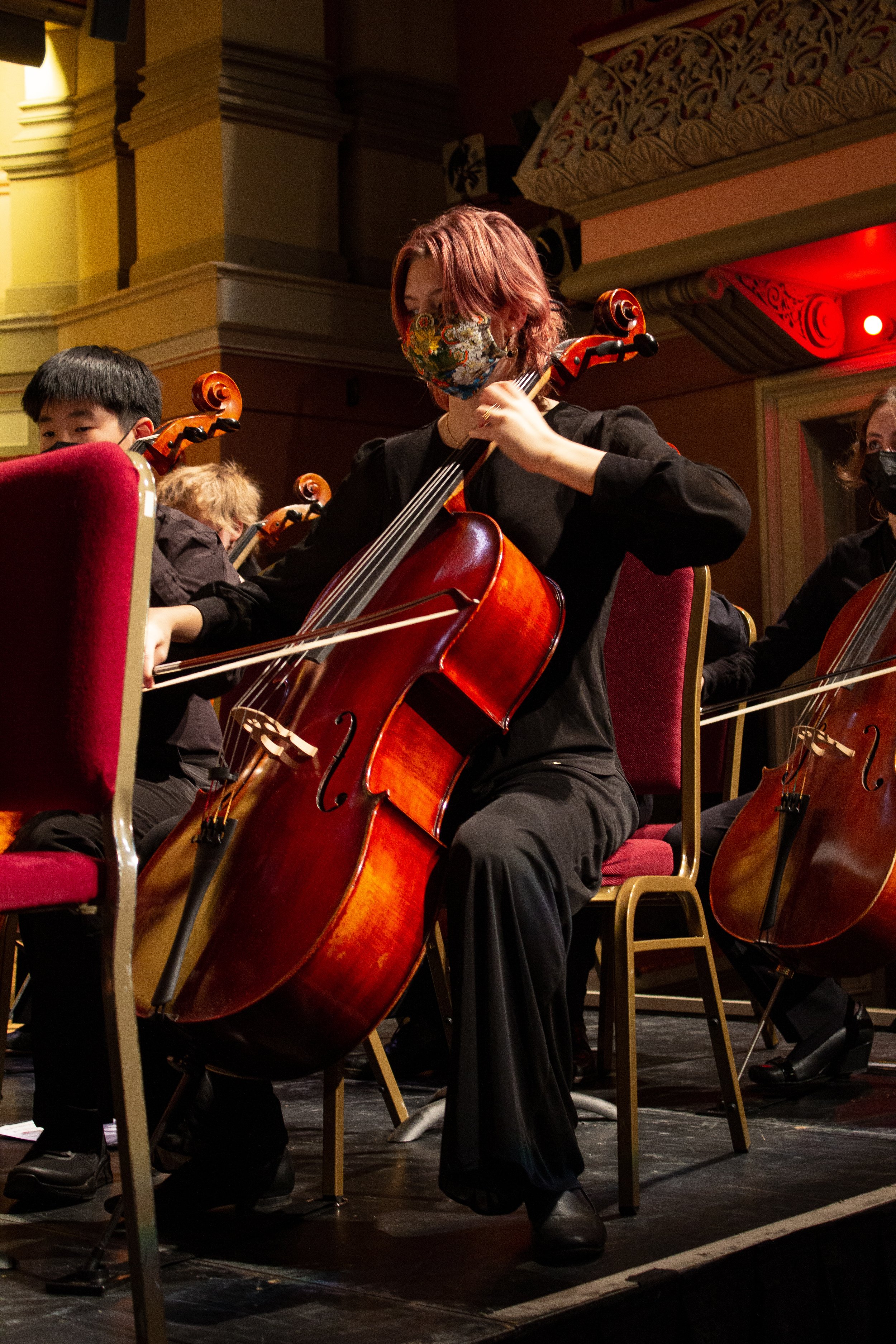
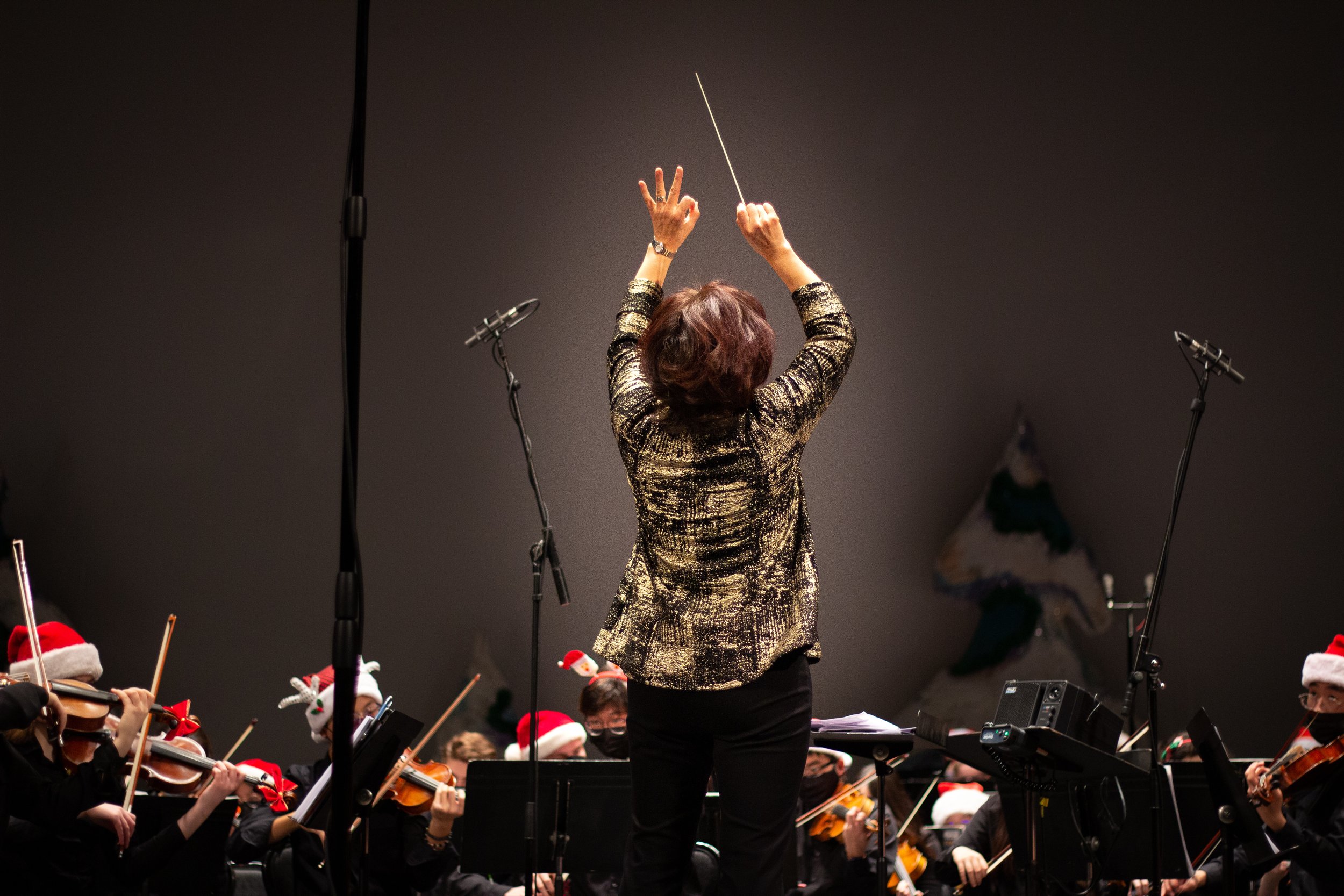
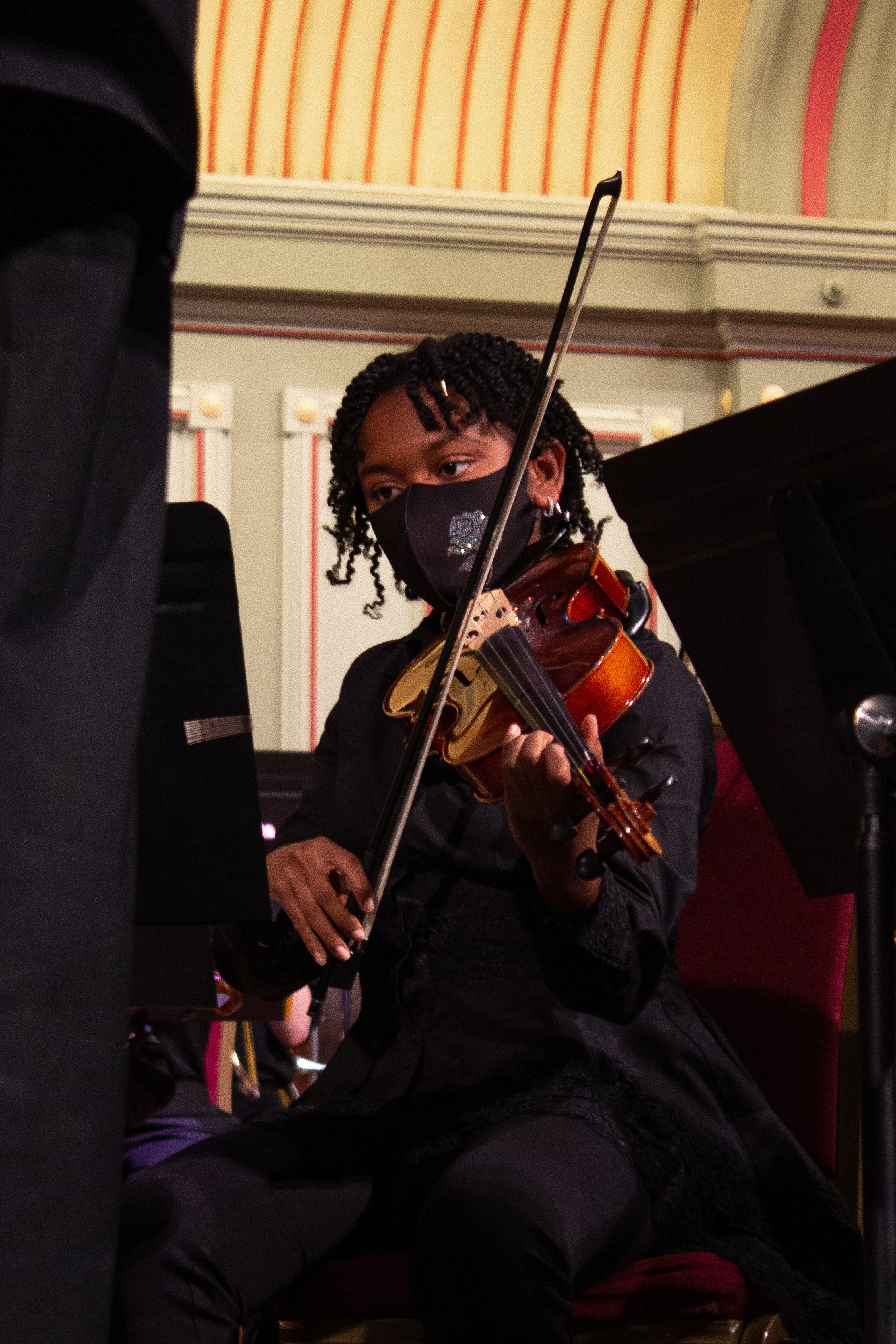
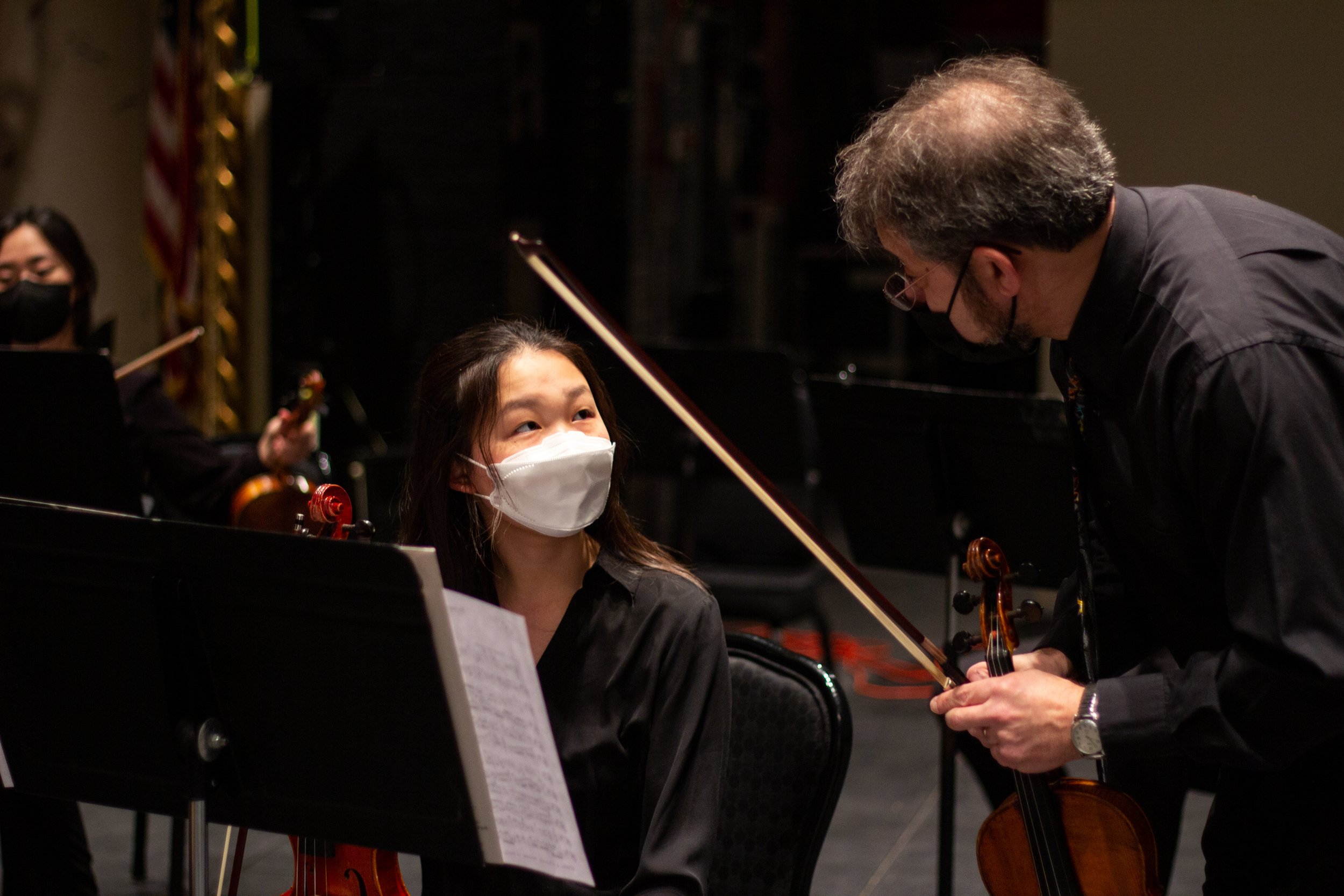
PHOTO HIGHLIGHTS
I also acted as an ESYO photographer, below are a few of my favorite shots.